PROFESSIONAL SERVICES · CONCEPT CASE STUDY
Eastmere
Advisory
Senior counsel at decisive moments.
A strategic advisory brand built around clarity, judgement, independence and discretion — designed to close the gap between actual expertise and perceived expertise.
Eastmere Advisory is a fictional independent strategic advisory firm created as a concept case study. It exists to demonstrate NWD’s strategic and creative process — not to represent a real client.
- Project type
- Concept project
- Sector
- Strategic advisory
- Market
- Australia
- Engagement
- Brand strategy, visual identity, website
- Core idea
- Senior counsel at decisive moments.
01 — The situation
The brand was not keeping pace with the trust.
Eastmere Advisory had built its reputation the right way — through referrals, word of mouth and the quality of advice delivered at critical moments. The firm works with founders and leadership teams of privately owned businesses facing the decisions that matter most: growth, restructuring, succession, transaction, strategic redirection. Not framework delivery. Not broad-brush consulting. Senior counsel brought in when the consequences of getting it wrong are too significant to improvise.
The problem was that nothing about the way Eastmere presented itself communicated any of that.
The brand looked like most other small advisory firms — capable, but generic. Professional, but not authoritative. Experienced, but with nothing to distinguish it from a dozen competitors describing themselves in the same language: strategy, transformation, performance, growth. Words so broad they belong to almost anyone.
The firm’s clients trusted the judgement behind the business. The brand was not keeping pace with that trust.
02 — The diagnosis
The deeper issue wasn’t the logo.
The deeper issue wasn’t the logo. It was the absence of a clear position.
Eastmere was communicating what it does rather than when its expertise becomes valuable. That’s a common problem in professional services — businesses default to describing services rather than describing the situation a client is in when they need those services most.
The insight that unlocked the brief was this: clients don’t go looking for “strategy”. They find themselves facing a consequential decision, and they need someone with enough experience to challenge their assumptions, enough independence to tell them the truth, and enough discretion to be trusted with what they can’t say to their own board.
That moment — the inflection point — became the foundation of everything.
03 — Strategic positioning
Senior counsel at decisive moments.
Eastmere was repositioned as an independent strategic advisory firm for businesses at an inflection point. The positioning moved deliberately away from conventional consultancy language. Rather than presenting the firm as an external provider of tools and frameworks, Eastmere was positioned as trusted senior counsel working alongside leadership during the moments that define a business’s direction.
Four ideas underpin the brand: clarity, judgement, independence and discretion. These aren’t marketing words — they’re functional descriptions of what Eastmere actually provides.
The brand proposition — Senior counsel at decisive moments — communicates the firm’s role without listing a catalogue of services.
04 — Visual identity
Warm, mature and certain.
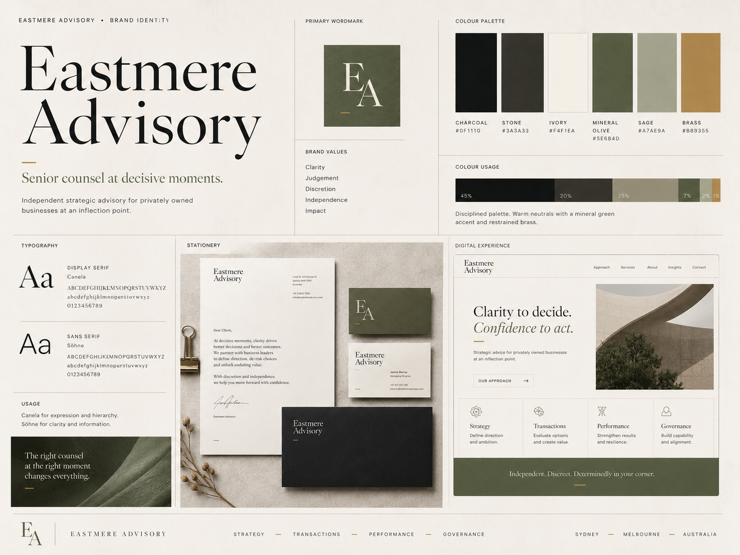
The visual system was designed to feel deliberately unlike the predictable palette associated with financial and consulting firms. No corporate blue. No stark luxury monochrome.
The identity is built on warm ivory as the dominant surface, with soft stone, deep charcoal, mineral olive and restrained brass. It’s a palette that reads as understated, mature and certain.
Typography carries much of the authority. A high-character serif is used for headlines, statements and strategic language; a restrained contemporary sans serif for body copy, navigation and technical content.
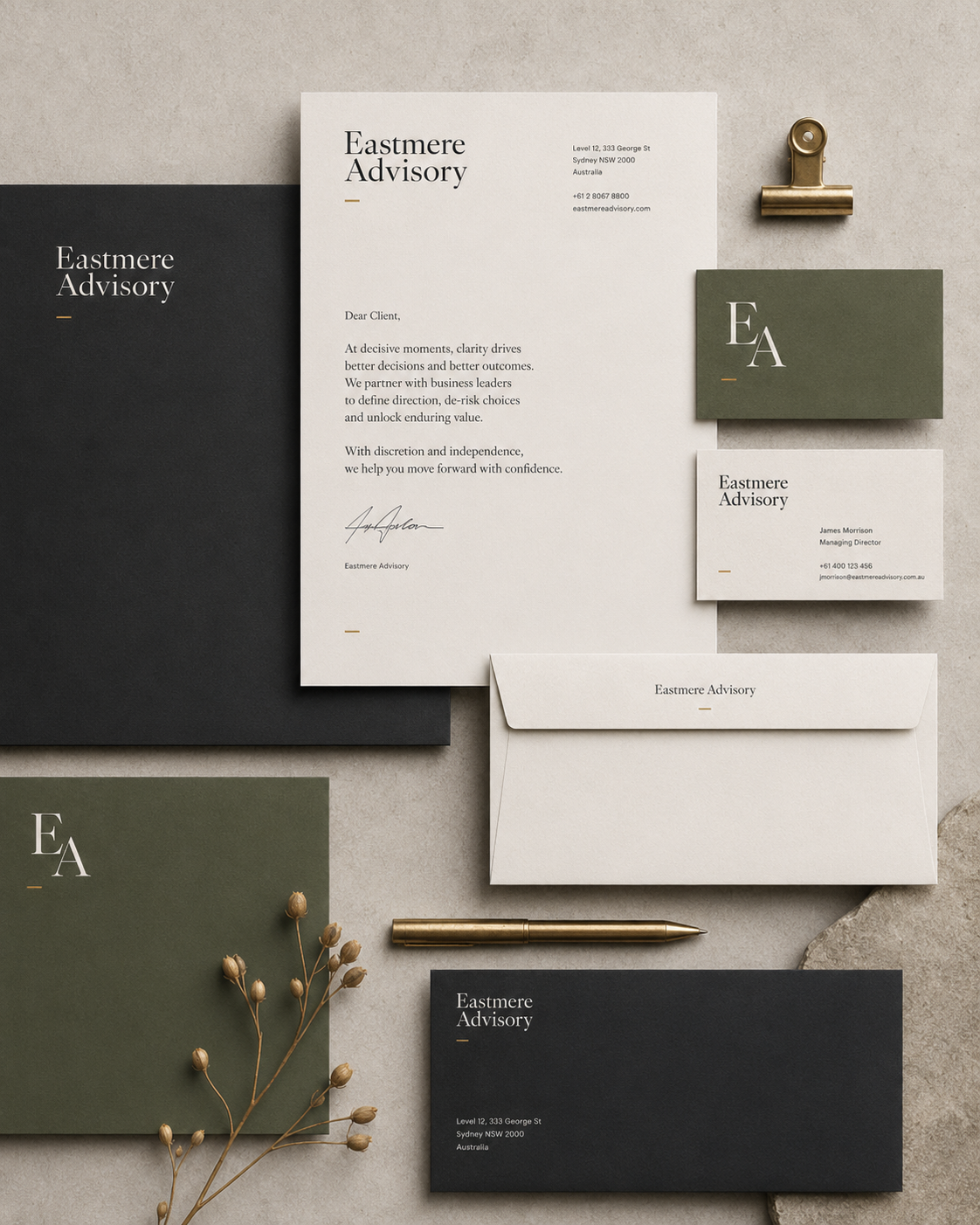
The primary identity uses a refined serif wordmark — Eastmere Advisory — supported by a secondary EA monogram for smaller applications.
05 — Document system
Core identity, not an afterthought.
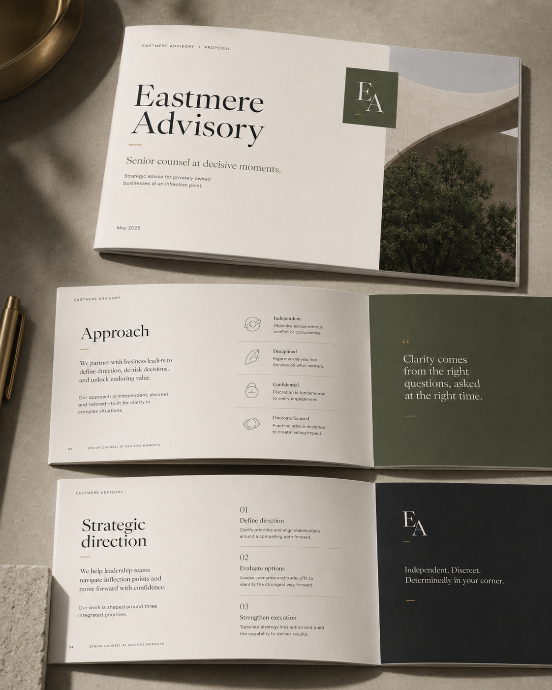
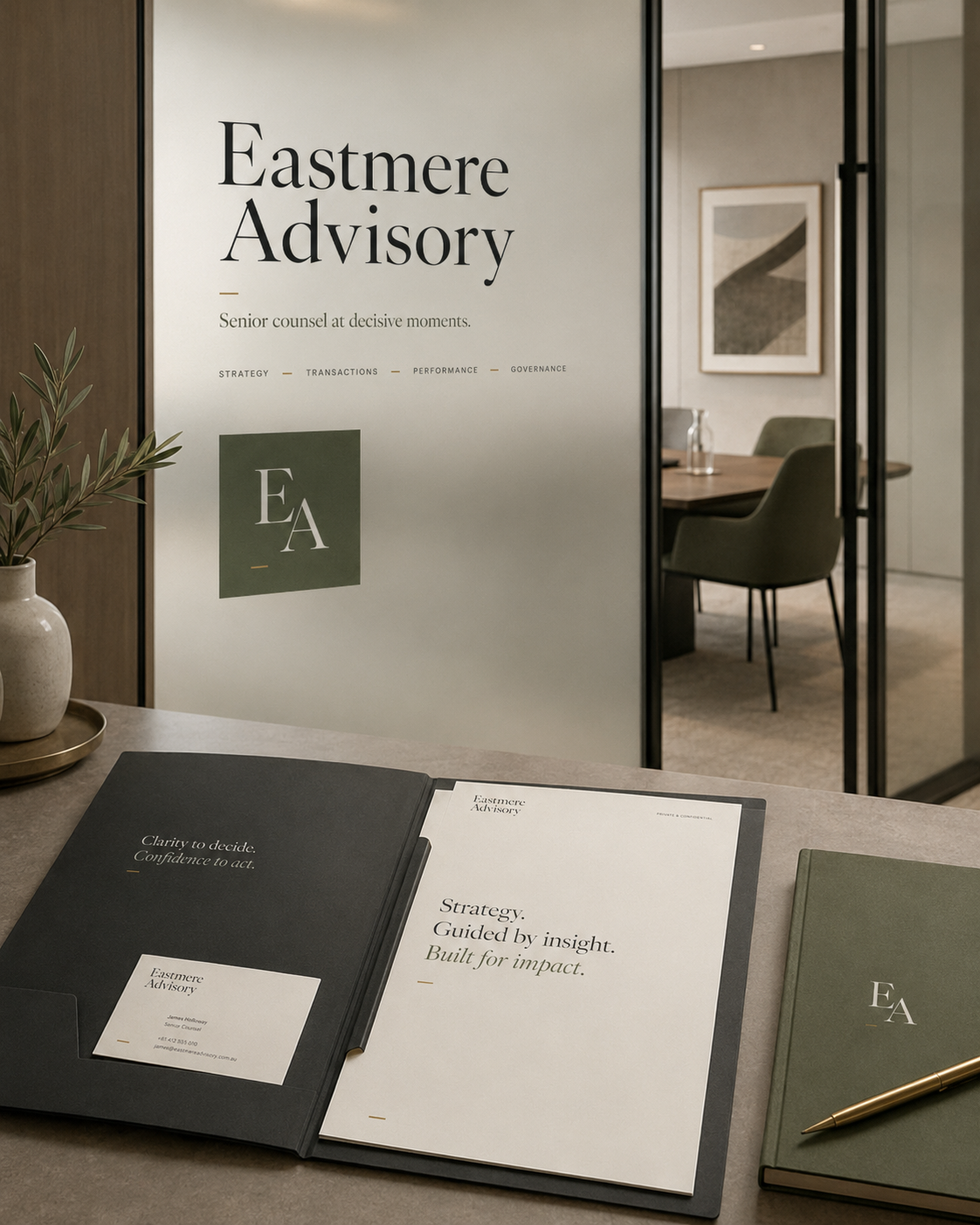
In a senior advisory business, the proposal and strategic paper are often experienced more frequently than the website. The document system was therefore treated as core identity, not an afterthought.
Proposal layouts use generous margins, strong serif headings, structured hierarchy, olive and charcoal section pages and fine brass rules. The result communicates rigour without resembling a corporate PowerPoint template.
05 — Digital experience
A position before a service list.
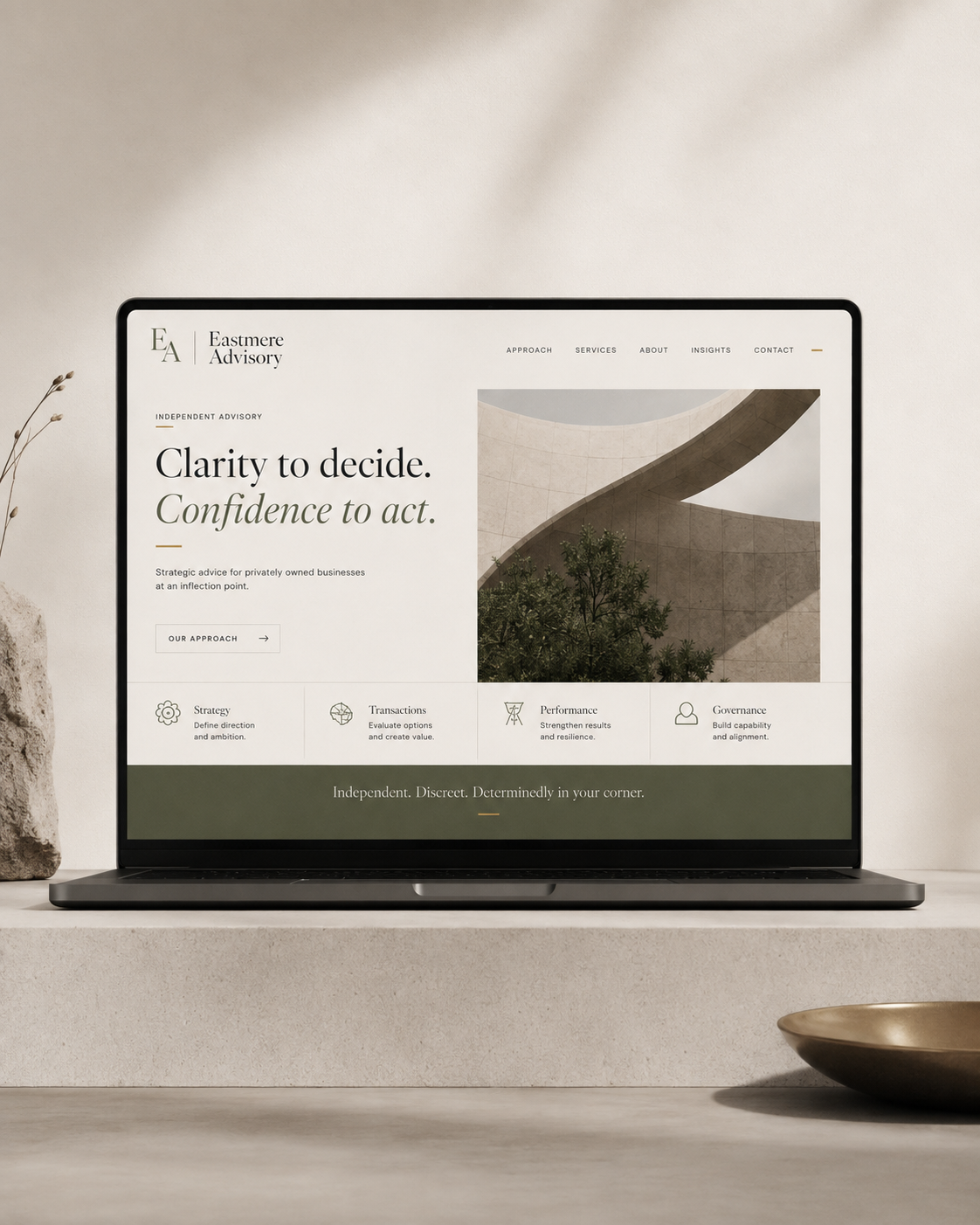
The website is built around a single question: what does a prospective client need to believe about this firm before they’re willing to trust it with an important decision?
The homepage doesn’t open with a service list. It opens with a position — Clarity to decide. Confidence to act. — and lets that lead.
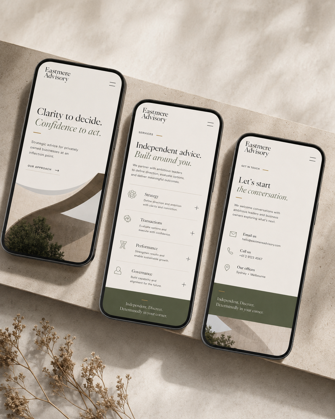
The mobile experience preserves the same hierarchy rather than compressing the desktop site.
06 — Mobile system
The same authority, in hand.
The digital system carries the same editorial hierarchy into a mobile context, keeping the proposition, proof and next step clear without reducing the brand to a compressed desktop layout.
07 — Outcome
Situation first. Then identity.
This concept project shows NWD’s approach to professional-services branding: situation first, then diagnosis, then positioning, then identity.
The visual work follows the strategic decision — it doesn’t precede it.
The completed system gives the fictional firm a clearly defined position, differentiated messaging, a recognisable identity, a refined document system and a digital presence designed to close the gap between actual expertise and perceived expertise.
Next project
Orren Objects
Design-led ecommerce